

By Emma Dyson
Tags: Design

Whether you’re working with a designer on a website or app or doing the design yourself, these 10 UI design tips will help you deliver a tool that users love to use.
Good UI (User Interface) design needs an understanding of human psychology. These UI design tips are based on how humans perceive and manipulate digital tools.
This is the most important of our UI design tips. Users should come before business needs. What does the user want out of their experience on your website or app? What journey do they take on your website? How is this adding value for the users? If your website is designed with a user-first approach, you are well on your way.
One way Boost does this is by creating user personas. We create fictional characters based on our research into the client’s target customer. We come up with their age, a name, occupation, interests, etc. This enables the team come up with user stories (requirements) with the personas needs in mind. It helps everyone work towards a common goal, and helps with prioritisation of the backlog of stories. A typical story might be ‘as Charlie Changemaker I want to purchase a product online so I don’t have to ring up and order during business hours’.
Make sure you keep content to a minimum. Summarise where you can and use graphical elements, images and bullets points to help break up text. Too much content can invoke stress, anxiety or boredom for your users. Most people are inherently visual thinkers not data processors. Users want to find things quickly and with ease, they don’t want to feel overwhelmed or overloaded by reading through pages and pages of text. Keep your content clean, organised, easy to read and concise. Having content in the right places will make visitors feel in control and will make them feel good afterwards.
A visual hierarchy should be built into the design. This directs the user to the key information and message, and makes the page easier to scan. You can do this a range of ways. Here are a few common options:
Users will read bigger things first.
You can use colour for hierarchy and to create a personality for your brand, so be sure which you’re using it for. Bright, contrasting colours stand out from duller colours.
Dramatic shifts in contrast can make things stand out, whether that’s typography, colour, images etc.
When things are close to each other, they form groups. Proximity is also the quickest way to associate similar content.
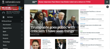
For example, in the example below the main heading stands out because of the contrasting tint of white on black, the large size, and even the font choice as the bold sans serif font contrasts with the serif font used above and below it. The pink menu and logo then draws your eyes because of the bright colour.

A mental model is what the user knows or thinks they know about the system (in this case a website or app). Before they use your system, users already have mental models about how it should behave. These are based on other similar systems they have used. This is why it is important for your UI to use universal features that users recognise, and behave similarly (e.g. clicking on a trash can deletes the item). You can be different and innovative, but you need to be sure the new approach is clearly superior.
Users will form mental models of your system, but be aware they may form incorrect mental models if something isn’t clear or is confusing. Use consistent elements, behaviours, colour, repetition to aid strong mental models. The best way to figure out users’ mental models of your system is to conduct user testing. Get the users to talk aloud when they are going through your UI, telling you where they would click to get somewhere, what they are thinking etc. This will allow you to see and change any user experience problems before you launch.
Hick’s Law states that every additional choice increases the time required to make a decision. Most people think they want more options but studies have shown otherwise. If users are faced with too many options, they will take too long or not choose at all. The more options a user must pick from — e.g. products, images, pathways — the more energy it takes to make a decision. Hick’s law tells us to keep options to a minimum, this applies for everything on your website or app.
Fitts’s Law is the prediction of the time required to rapidly move to a target area in a user interface. It’s a function of the ratio between the distance to the target and the width of the target. In web/app design we want users to find their targets quickly and efficiently. We can do this in a range of ways, here are a few:

Here are some more ways to apply Fitts’s Law to your user interface.
Making an emotional connection with your users is important because it creates an experience for users that make them feel like there’s a person, not a machine, at the other end. This makes people feel more in control and comfortable which will build trust in your product or service. Here are a few ways to connect emotionally:
People are naturally drawn to other people’s faces more than objects, landscapes or abstractions. This is because by nature we constantly seek emotional connections with others. When we see a face we automatically empathise with that person. Avoid stock photographs when you can as these can look inauthentic.
The tone you use in your content should be a reflection of your brand personality. Your website is usually your first and most important impression on potential customers, so make sure you think about the tone of voice you want to portray. MailChimp does this extremely well. By using a fun, friendly tone of voice they make users feel more comfortable and feel at home.

The use of colour can have an effect on how we interpret a brand, and how we connect emotionally.
Colours used on your website should be a continuation of your brand identity (your designer should have considered the psychology of colour when designing your brand).
How you use colours on your website also affects how the visitor feels when they visit your site. For example, if your organisation’s main colours were red and blue, it’s very unlikely that you would have a big red background with blue text. You would use the secondary neutral colours to take up most of the real estate on your page and then use red and blue sparingly to highlight important content. These neutral colours act like white space, giving your eyes a chance for a rest. If you were a fun, friendly company you may use more colour and graphics in your design. Slack for example use vibrant colours, friendly typefaces, and illustrations which make the app feel playful and fun.
Read more in depth about the psychology of colour.
White space (negative or blank space) is the careful use of gaps between design elements to create and direct the viewer to the hierarchy of the design. The correct amount of white space makes a design clean — essential to communicate a clear message.
White space increases readability as a page cramped with text, images and content leaves no resting place for the eyes and can become too overwhelming and hierarchy can be lost. White space used correctly helps us find the key elements quickly.
Balance in design is similar to balance in physics. Usually you will want a design to feel balanced on either side. For example, if there’s a large shape on one side close to the centre you can balance it with a small shape on the other side closer to the outer edges. Normally you will balance the whole page out left to right and top to bottom.
Typography conveys a lot of emotion and feelings for your users/visitors. There are thousands of typefaces out there and now the web has access to most of these as well. Serif fonts are often associated with professionalism, tradition, scholarship and seriousness, while sans serif are more modern, clean and informal.
E.g. The New Zealand Herald website uses a serif font, to portray that it’s a serious and traditional brand.
Hope you find these UI design tips helpful.

